
A New Digital Experience for a Law School
A Law School from Minas Gerais, Brazil, that offers educational services online, proposed a freelancer project to review its website to improve the user experience and visual design of its website.

My role
2025
Education
Freelancer project
Client: EMD - Escola Mineira de Direito.
Project Overview
The client of this project is a Brazilian law school. They offer multiple educational services, including online events, lectures, and postgraduate courses. Based on feedback, internal teams understood that students were having trouble accessing some of the website's functionalities. The company decided to improve the user experience and visual design of its website. The prototype was created in Portuguese.
35%
Improved onboarding process
25%
Increase in user retention
84%
Increase in time spent on website


Empathize
⚠️Problem Statement
The law school's original website presented significant usability and engagement issues. Students considered it difficult to find information about courses and events, and the overall experience lacked clarity and visual consistency. These factors contributed to reduced student interaction and retention.
🎯Objective & Goals
Enhance students experience
Redesign the website to improve navigation, enhance the user experience, and ultimately encourage more students to return to the school.
Develop an Event page
Create a practical, useful page to showcase school events, provide access to past events, and enable certificate retrieval.

Define
🔎Research methods
For this project, we have focused on collecting data from desk research and benchmarking. The object of this research was to understand good practices of big law schools and other kinds of educational institutions. The goal was to absorb design ideas and the best solutions.
Benchmarking
We have examined websites from leading law schools, universities, and the best educational institutions to identify best practices in layout, content organization, and user flows.
Desk research
We analyzed institutional reports, feedback from students, and usability studies of theducational platforms. We also analyzed their current website to understand important opportunities to improve usability and visual issues.

Ideate
💭Brainstorming sections
For the ideation phase, we had a brainstorming session with the Development and Marketing teams to validate needs, insights, and prioritize ideas.Benchmarking

Finding - Main Page & Courses page
Showcase Educational Approach
Improvements on the subscription path
Reorganize courses and events by categories
Improve the offer of the related courses and events
Add testimonials and feedback from students
Finding - Events Page
Feedback after attending an event
Embed Youtube channel
Easy option to share event
Offer of related events
Easy access to the certificate
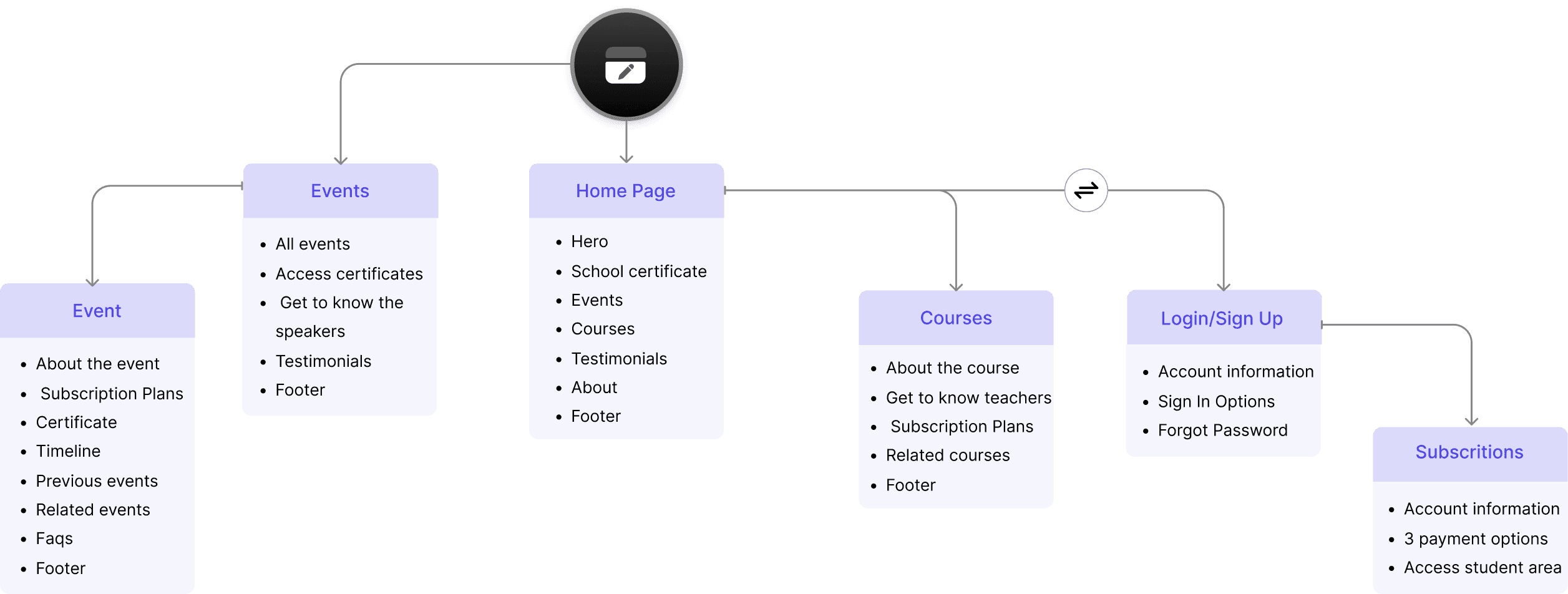
Site Map
The organization of the website came out as follows:
Delivery
🎨 Style Guide
Grids & Typografy
For this project, we paired DM Sans and Poppins to create a clean, modern, highly accessible digital environment. This combination balances geometric precision with a friendly, approachable tone, low contrast, and professional character, ideal for this product.


Colors
To create the color palette, I took into consideration the company logo's colors and style. They use the primary color - Crimson Red C71517 - in the logo, and mainly black and white in the old website.
I have proposed the following combination:
Primary:
Crimson Red (#C71517): A bold, high-visibility red used to drive the core user journey. It signifies importance and action, ensuring that primary goals are never missed.
Secondary:
Cerulean Blue (#247BA0): This shade is bright enough to feel modern and tech-forward, yet deep enough to provide a sense of security and logic. It creates a professional atmosphere without feeling 'heavy' or outdated.
Tertiary:
Ochre Gold (#B5910A): A warm, sophisticated accent that bridges the gap between the intensity of the red and the coolness of the blue.

Components library
To ensure long-term scalability and design-to-code alignment, we developed a comprehensive Component Library. This systemizes our typography, colors, and other elements like buttons and form fields, allowing for rapid prototyping while maintaining 100% visual consistency across the platform.
Buttons & Forms


Mid-fidelity Wireframes


Conclusion
The project was delivered after reviewing all the features and UI design with the market and developer teams.
The final result was parcialy maintaind by the company. They used mainly the organization the the pages, which I believe improved the website. On the other hand they decided to use a dar pattern for the visuals.